Waiting Zine Introduction
I am the most impatient person I know, even the notion of me making a zine titled “waiting” is almost laughable. Through the pandemic I was forced to wait for the unknown. As an impatient person I struggled deeply. I am constantly planning out my future and where I wanna go in life. The unknown of when this is all gonna end can be overwhelming at times. Looking through all of the imagery I included I feel l accurately represented what waiting feels like to me. These are all appropriated images I discovered on pinterest. This zine is a visual anthology and representation of my experience waiting.
Glendalys Medina Drawing
Glendalys Medina's work was very unique and thought provoking. Throughout the experience I felt really engaged and felt actually connected for the first time ever on a zoom call. Her story and how she became an artist was truly inspiring. I especially enjoyed her box project and the comittment she has to her art. During the drawing section we were told to grab three shapes one round shape (I used a cup) one square shape (I used a charging block) and one wildcard shape so of course I choose a figit spinner...Anyways I draw a outline of the shapes and then drew a redline connecting all the shapes with a heart beat pattern inside the shapes. I then drew a heart in the center square. The piece as a whole is suppose to represent my anxiety. I showed it in the call and I said I was going to rework it. I lost the original drawing and I was freaking out but then I was on the visual thinking website and a screenshot of all of us holding up our work with Glendalys Medina popped up. I saw a really poor quality of my drawing but it was better than nothing. I took a screenshot of the screenshot and brought it into Illustraitor and traced the shapes. I didn't like the original placement and shape choice (figit spinner) so I eventually just used triangles in their place. I then took the revamped drawing from illustraitor and in photoshop added a paper texture similar to what I did with the news print project. I thought it looked more like a drawing that way.
Color
For this I took an image that I personally took and put it in adobe color and found a greenish purple color way that I personally love. It is really rare to see green and purple used that often and I think they go really well together. I manipulated the original image to make it look that way so hopefully I will be able to recreate it. For the second color selector image I found on pinterest. I have been obsessed with that specific color way and it was really helpful to use the software to grab the certain colors from the image. I am definently going to be using adobe color more often in my everyday photographic process.
News Project
For these pieces I looked over all the imagery that was available on the newspaper and cut out all the ones that caught my eye. The first is my favorite and is the only one with a title. It is called "God's Torture". I wanted to showcase an abstract collage style piece about serious topics which are the pandemic and racial inequality. After I cut images out I taped them onto a piece of bristol paper. After I got the position I wanted for all the collage pieces I photographed each collage. I then in post processing added paper textures to make the imagery look more like an overlay. It was very hard to look at the news but making this helped me somewhat process this hell of a year.
Line Artist Statement
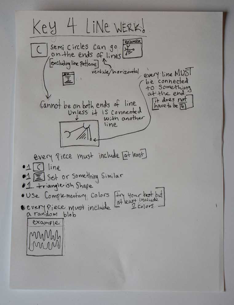
With this piece I wanted to think before I put my pen to paper. Often times when I am marking any sort of line work I am often just drawing mindlessly. With this piece, every line and color was extremely intentional. Creating rules for myself in life and art can be hard for me. I am a very unorganized being. Creating a piece that follows the rules I set for myself was so rewarding because it made the pieces more meaningful. I wanted the vibe of the piece to be futuristic and simplistic. Leaving negative space can sometimes be a challenge because I enjoy filling an entire page. I think with these works especially the negative space creates a more visually appealing image rather than the more overwhelming and chaotic works I am accustomed to making.
Embroidery Artist Statement
I have sewn only a few things in my lifetime. I think its such a vital skill to have. When making this specific piece I wanted to create something simple but visually pleasing. I used a pencil to outline the phrase “But I Love You” with a little face at the bottom. I used the colors blue for the words; But, I, and you. I used green thread for the word “love” and black for the little face. Using different colors for certain words or imagery really emphasized my feelings towards love which is the face at the bottom of the piece. I have never felt true unhinged love. I obviously want to experience it eventually in my lifetime. Right now I am ambivalent towards love and I think that sometimes I often feel like I have to force myself to “like” someone. I often convince myself that I “love” someone when in reality I do not. This phrase “But I love you” is significant because, in reality, I don’t love you (the person I am saying it to). I think with the little face at the bottom it dissolves any sense of true seriousness which I believe is part of the reason why I cannot find love.
Metashape
I was really excited to learn how to use metashape at first. After a taking a million photos of every single object I became really frusterated. At the time I was going through a lot of stress and got overwhelmed. I tried doing it again. I filled up an entire SD card with images. I am so sorry I shouldve done more to complete this assignment it was just very confusing and frusterating to use.